I was hoping for Newt Gingrich, and Donald Trump’s “gut” wanted to go with Chris Christie, but family members and campaign chairman Paul Manafort managed to persuade the impulsive billionaire that Mike Pence was the smart pick. The Indiana governor is a strong conservative and could do the most unify the party, having endorsed Ted Cruz in April.
Trump should have been able to get a boost from his running mate choice going into the Republican National Convention. Instead, he fumbled the rollout in several ways, summarized well by Philip Bump. It must have humiliated Pence to have CNN, the New York Times, NBC News, and other media outlets focus on Trump’s last-minute doubts about the pick, instead of on what Pence brings to the ticket. Christie suffered an even greater blow at the hands of the man he endorsed in February.
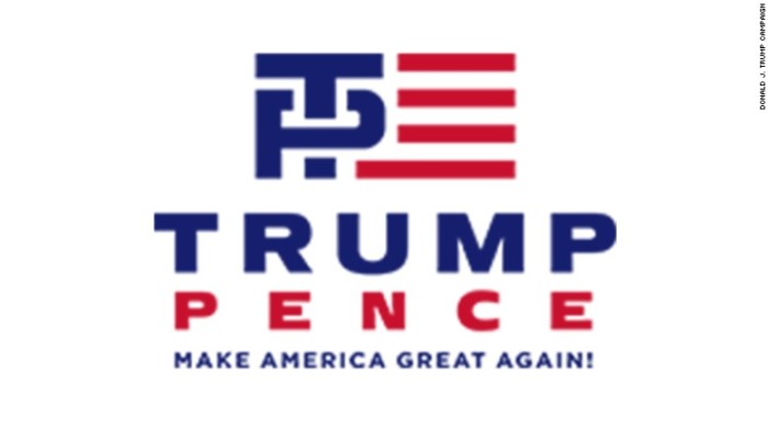
I’m no graphic design expert, but the Trump-Pence logo is a disaster. I thought it was a joke the first time I saw it yesterday, when a Facebook friend shared this not-safe-for-work commentary. Gregory Krieg reported more delicately for CNN that the logo “is raising eyebrows” and “drawing titters from cheeky tweeters.” Iowa Twitter user @jbelcap pointed out that there is a “hidden negative space H” in the graphic as well.
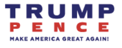
Any comments about the Trump-Pence ticket are welcome in this thread. UPDATE: It took only one day for the Trump campaign to dump the logo and scrub all images of it from the website. The new logo is after the jump.
New Trump-Pence logo, released on July 16:


